When designing with interior WPC wall panels, choosing the right color combinations can transform your space from ordinary to extraordinary. WPC panels offer incredible versatility, durability, and aesthetic appeal, making them perfect for modern homes and commercial spaces.
In this guide, we’ll explore trending color palettes, how to match WPC panels with your décor, and expert tips for creating a harmonious interior.
1. Trending Color Schemes for WPC Wall Panels
The right color combination can enhance mood, define spaces, and elevate your interior design. Here are some top trending palettes for WPC wall panels:
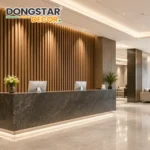
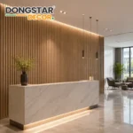
Neutral Elegance (Whites, Beiges, & Grays)
Perfect for: Minimalist, Scandinavian, or modern interiors
Why it works: Creates a clean, airy feel and pairs well with any furniture
Best accents: Wooden textures, black fixtures, or metallic finishes
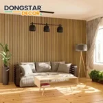
Earthy Tones (Greens, Browns, & Terracottas)
Perfect for: Rustic, bohemian, or nature-inspired spaces
Why it works: Brings warmth and a natural, organic vibe
Best accents: Rattan furniture, indoor plants, and stone décor
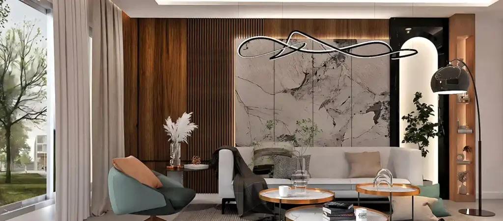
Bold & Dramatic (Navy, Charcoal, & Deep Blues)
Perfect for: Contemporary, industrial, or luxury interiors
Why it works: Adds depth and sophistication to feature walls
Best accents: Gold hardware, velvet upholstery, and statement lighting
2. How to Match WPC Panels with Your Interior Style
Choosing the right WPC panel color depends on your existing décor and desired ambiance. Here’s how to seamlessly integrate them into different design themes:
A. Modern & Minimalist Interiors
Recommended Colors: Soft grays, matte whites, or light wood tones
Design Tip: Keep it simple with monochromatic schemes and sleek furniture
B. Industrial & Urban Loft Spaces
Recommended Colors: Dark browns, concrete grays, or blackened wood
Design Tip: Pair with exposed brick, metal accents, and open shelving
C. Coastal & Light-Filled Homes
Recommended Colors: Soft blues, sandy beiges, or whitewashed wood
Design Tip: Add nautical décor, woven textures, and natural light
D. Warm & Traditional Settings
Recommended Colors: Honey oak, walnut brown, or cream tones
Design Tip: Complement with classic furniture and rich textiles
3. Expert Tips for Choosing the Right WPC Panel Colors
Consider Lighting Conditions
North-facing rooms: Warmer tones (beige, cream) to balance cool light
South-facing rooms: Cooler tones (gray, blue) to prevent overheating
Use the 60-30-10 Rule
60% Dominant Color (WPC wall panels)
30% Secondary Color (Furniture, cabinetry)
10% Accent Color (Decor, artwork, cushions)
Test Samples Before Committing
Order small WPC panel samples to see how they look in different lighting
Mix Textures for Depth
Combine smooth and wood-grain WPC finishes for visual interest
Final Thoughts
The right interior WPC wall panel color combination can completely redefine your space. Whether you prefer neutral elegance, earthy warmth, or bold statements, WPC panels offer endless design possibilities.
Ready to upgrade your walls? Explore Dongstar Decor’s premium WPC wall panel collection and find your perfect match today!